
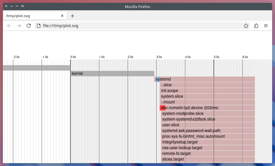
In modern GNU/Linux systems with systemd as the system and service manager, understanding the boot process can be vital for performance tuning and debugging. One particularly handy tool is systemd-analyze plot, which outputs an SVG visualization of all services and devices involved in the boot process, showing their activation time and duration.
To generate and view this boot chart:
systemd-analyze plot > /tmp/plot.svg && x-www-browser /tmp/plot.svgThis plot is helpful for identifying slow-starting services, investigating dependencies, or simply understanding what happens between power-on and GUI login. The bars on the chart represent how long each unit took during startup.
Building a Native Viewer with Qt/QML
For a while, I had been planning to display the same information in a native desktop application, specifically a C++ app with a QML-based UI. Starting with systemd version 250, a new flag was introduced that outputs the boot timeline data in JSON format:
systemd-analyze plot --json=[short|pretty]Instead of having to parse the static SVG output, this new flag enabled me to work directly with structured JSON data.
Introducing My Application
The app I’ve developed parses the JSON output and populates a list of all startup services, along with their start times and durations. Then, using QML, it displays a visual timeline that closely mimics the style of the original plot.svg.
Here’s a screenshot of the application in action:
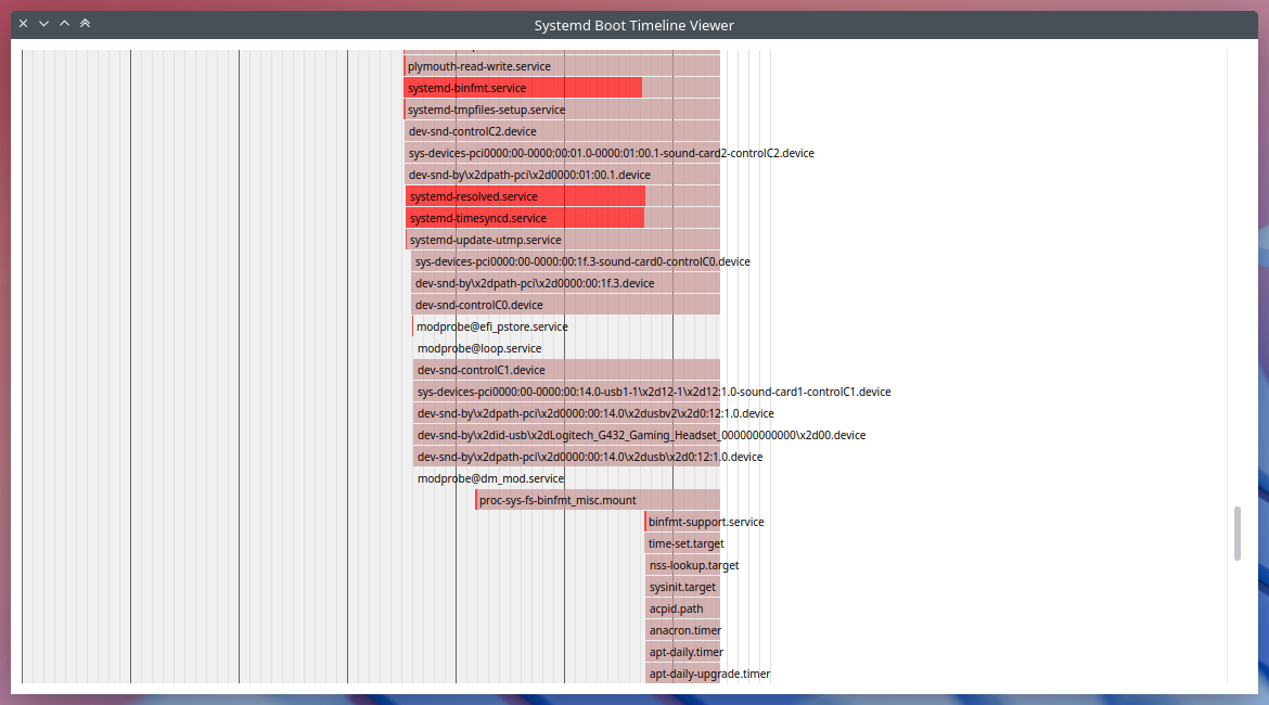
You can scroll through the timeline, observe overlapping service launches, and visually identify bottlenecks much like the SVG version, but now inside a GUI application of its own.
Limitations
There are a few limitations at the moment. As of the systemd version my system is using (255.4-1ubuntu8.8), the JSON output unfortunately omits the firmware, bootloader, and kernel stages entirely. So, at least until upstream includes them, my application currently starts at the first systemd-managed unit and is unable to visualize these early boot phases.
Source Code
The source for this application can be accessed at https://github.com/efeciftci/qsystemdplotter/. After installing the required build dependencies, it can easily be built with:
mkdir build
cd build
cmake ..
make
Roadmap / Future Ideas
There are several improvements I’m considering for future commits:
- Switch between system and user instances of systemd.
- Display the kernel, loader, and firmware timing (if systemd includes them in JSON).
- Hover popups for each service, showing detailed information about them.
- Adapt to system color schemes instead of hardcoded colors, for a more native KDE/Plasma look.
- A configuration panel for setting plot scale, time units, and filtering specific unit types.
Final Thoughts
I hope this application can grow into a more comprehensive systemd-centric KDE utility, one that integrates well with the Plasma desktop and offers deeper insights into system internals in a beautiful and accessible way. Contributions, bug reports, or feature ideas are more than welcome!
Happy boot analyzing!